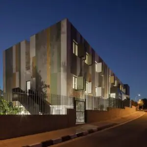
Have you ever been inspired by a baked potato? Most of us haven’t. However, creativity often requires an open mind, and this collection of unexpected exterior building designs are some of our favorites that stand out from the crowd.
Markel Building
The Markel Building, located in Richmond, Virginia and owned by the Markel Corporation, was designed by Haigh Jamgochian. Henrico County, where the town is located, offers the following description,
The aluminum clad conical structure was inspired by a baked potato wrapped in foil served to Jamgochian while attending an American Institute of Architect’s dinner. Each floor consists of a single piece of 555-foot aluminum. They are the longest unbroken pieces of aluminum ever used as siding material. Jamgochian personally sledge-hammered crinkles into the 3rd floor siding before contractors finished the job on the other two floors in 1965.
Aberystwyth Arts Centre
The Creative Studios Project consists of eight buildings designed by Heatherwick Studio at the Aberystwyth Arts Centre in Wales. The project functions as a creative hub for start-up artists. It received a Royal Institute of British Architects Award for buildings that have high architectural standards and make a substantial contribution to the local environment. Per designboom,
Striking in design the simple timber‐frame buildings are clad with a bespoke crinkled stainless steel system that creates a shimmering futuristic appearance, reflecting the greenery of the site. The special cladding system was fabricated on site using a contraption similar to a Victorian mangle that deformed the steel into its irregular form. The studios sit within woodland, and over time will blend further into the maturing landscape around them.
Kufstein high school extension
Whether based on knowledge or the creative process, there are lots of metaphors for a crumpled piece of paper. Architect Johannes Wiesflecker’s new, eye-popping structure somehow partners with the original adjacent heritage school building that opened in 1907. According to the designers,
The view of the crinkled wall from the interior creates a special atmosphere. It seems to be staged and is dynamically reflected by daylight. This wall, integrated into the architecture of the school, is an icon for the school and a concise urbanistic module which highlights the topological and cultural identity of the town of Kufstein in a new way.
Design professionals, have you ever had your inspiration piqued by a far-from-the-norm source? Comment on this story on Instagram, Twitter, LinkedIn or Facebook, and share your story with us.


